Role and Responsibilities
- Worked with graphic designer to create an independent brand for this certification - primarily responsible for the web branding
- Created and presented design mockups
- Prototpye user testing
- Ensured all analytics, tracking, and workflow needs installed
- Completed all browser and mobile testing
Scopes & Constraints
- No budget
- Only front end and UX person
- Learned of a backend platform change after initial testing which negated half of my prototype
- Certification manager left company 3 months before launch
Timeframe
January-March 2020
Product
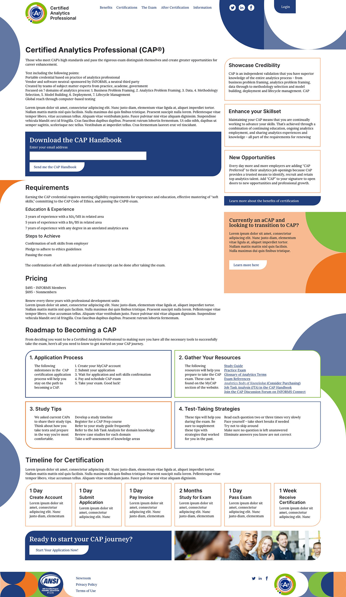
Certified Analytics Professional, or CAP, is a certification attainable by analytics professionals to distinguish themselves as highly knowledgeable and ethically minded within their field.
Problem
The CAP website hadn’t been updated since its creation about five years previously. They were looking for a new look that indicated the certification’s professional and highly regarded status while being more mobile friendly and easy to navigate.
What Happened
Created Brand Guidelines
I started by looking at the CAP logo. I liked the reasoning in its design and the use of 3 in it: three letters in CAP, three rings, three circles, three colors. I then sat down with our creative director and graphic designer and we used those as the basis for a CAP branding suite which included a design pattern that could be reused and put together in any way for any situation. This suite was then presented by myself and the graphic designer to the Marketing Director and the Professional Development client team.
Mockups
I used Adobe XD to create mockups of each page for the new website on desktop and examples of each page type on mobile. While working to create a library of components, I quickly discovered that making the design fully responsive would be very difficult while maintaining the amount of information and ease of navigation that was one of our main goals. To solve this, I chose to create two different stylesheets: one for desktop and one for tablets and mobile devices.

Prototype Testing
After converting the approved mockups to a prototype, I created and ran four user testing sessions to confirm the goals of the new site were being accomplished, centering on making sure information was easy to locate. For testers, I was able to use three testers with knowledge of the brand and one without any previous knowledge. This testing occurred remotely due to both not having any funding and it occurring during late 2020 with the COVID pandemic still in effect.
Results of Testing
Testing was very illuminating: while the main goals were being accomplished, there were still a number of changes that could push them even farther. Most of these revolved around the wording of navigation items and section headers that were very useful to take back to the Marketing team for content updates. There was a large concern for whether the content was being written with too much familiarity with the certification that might keep a new user from easily understanding what was being communicated, so these notes were invaluable to take back to the content writers.
Outcomes & Results
Successfully created a brand design for this product that was well received by the client. Also now have a design framework to follow should any issues arise or I need to pivot during the build for this project’s website. Project in general was ready for development.
Goals for the project were well achieved: the product now has a fresh, new design that integrates with the preexisting logo; the mockups have met the company’s desire to move to mobile first design principles; and my mockups have been tested for their top priorities: ease of use and information discovery.
Lessons Learned
Be ready to pivot.
Quickly into the mockup process, it became apparent that to leverage the new design pattern as fully as we wanted, I would need to create two designs - one for desktop and one for mobile devices. This would require much more testing and more mockups and components to create, but the result was well worth it. Having separate stylesheets for mobile versus desktop allowed the content to be much more coordinated for each experience.
A good presentation is invaluable.
Impressing the client and my director only came from being perhaps overly prepared at every opportunity. The graphic designer and I took the time to create specifically designed slides for the branding presentation and practiced our decision making walkthrough numerous times together beforehand. We did our best to answer any potential client questions before they even arose in our scripting, fully aware that our director likes to throw curve balls. All presentations of my work for this project resulted in higher client buy-in as well.