Role and Responsibilities
- Performed and presented all research
- Data collection and analysis
- Created new information architecture
- Mockups and design implementation
- Led content creation team of 2 (including SEO strategy)
- Storyboarded and animated 3 explainer videos
Scopes & Constraints
- No budget
- Beginning materials were only the previous website content and spreadsheet from completed projects
Timeframe
January 2019-June 2020
Client
Pro Bono Analytics (PBA) is a committee-run volunteer group that brings together analytics professionals and nonprofit organizations working in underserved communities with the goal of enabling these vital nonprofits to begin making data-driven decisions. In short, they can help a nonprofit organization decide how and when to collect data, where to keep it, and how best to use that data to make decisions, all for no charge for their service.
Problem
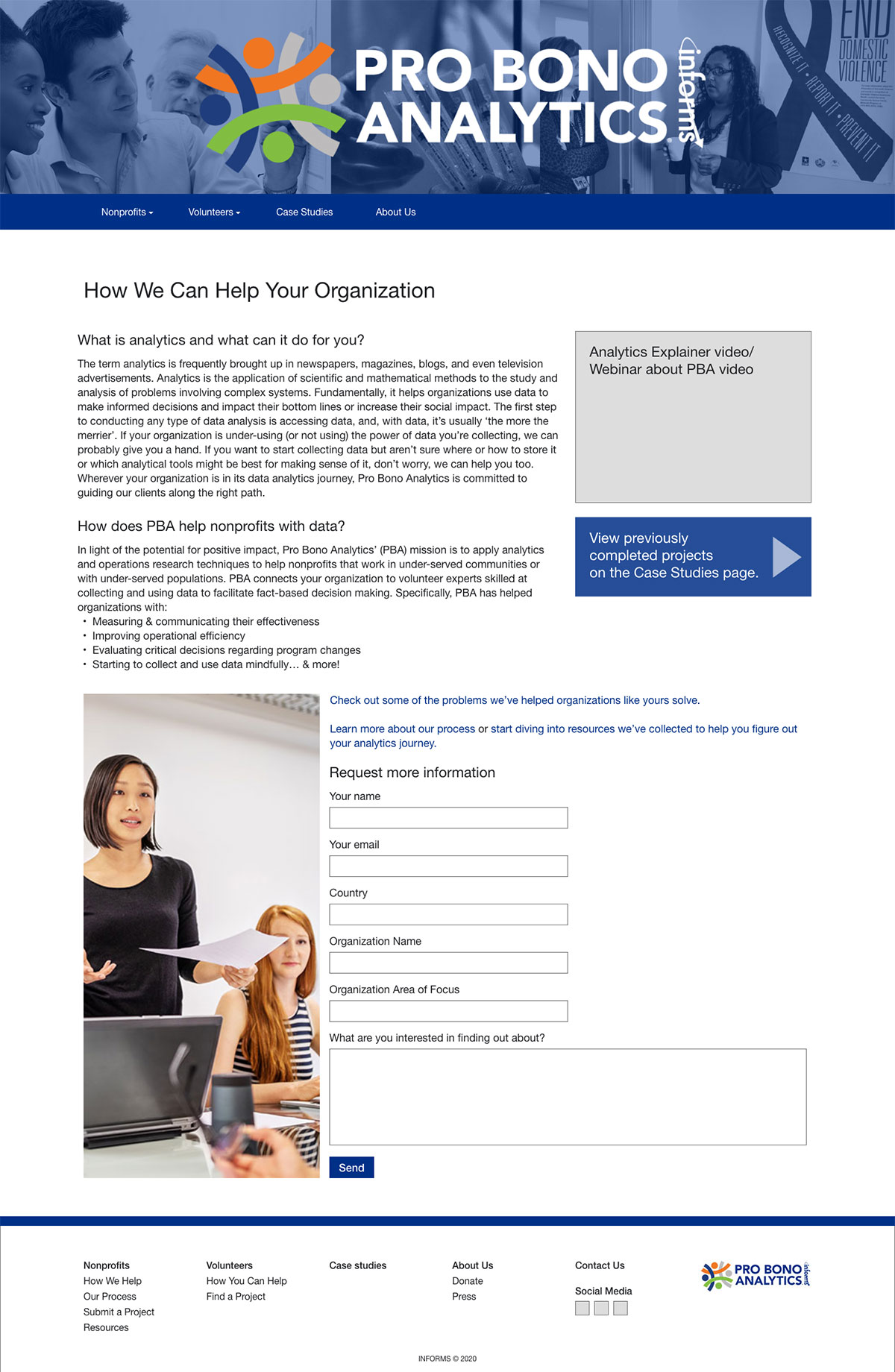
The PBA committee requested a redesign of their website due to low project submission rates and content sprawl that had occurred from when their website was created five years prior. Additionally, they had no search engine optimization (SEO) implemented and their search result rankings were very low to nonexistent. With a redesign, they wanted to see a rise in project submission rate from nonprofit organizations ideally due to a rise in pageviews and search engine result performance.
What Happened
Research
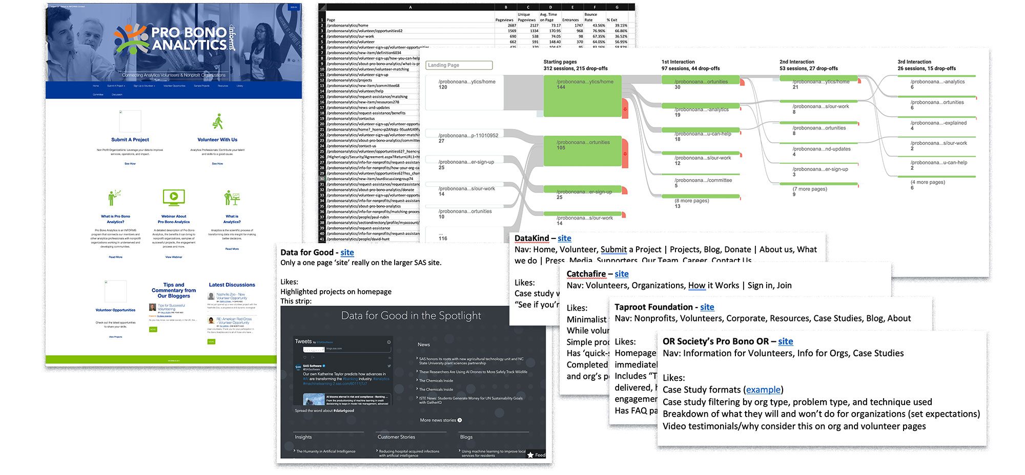
I began by speaking with the committee on their views of the website at that time and what they hoped to see change. I also went to the PBA website and performed a content and functionality audit to get a clear view of what was currently available.
I then went to Google Analytics and pulled comparisons between the last two years to see any trends between what pages were consistently visited and what, if any, search terms were used on the website. I also pulled Behavior and User Flows to gain a sense of what visitors might be looking for when visiting the PBA website.
Finally, I visited other websites with comparative services, both also working in analytics and in other fields, to gather notes on both how their information architecture was structured and what their websites offered that PBA might be missing or might align with the committee’s goals for their new website. This also proved useful later when presenting suggested changes to the committee as I could pull them from outside sources that they trusted and respected.
Audience
At this point, I was starting to gather my recommendation for the committee, but I knew we would need audience information to filter content through going forward. The previous website was built and maintained with no user or audience information involved.
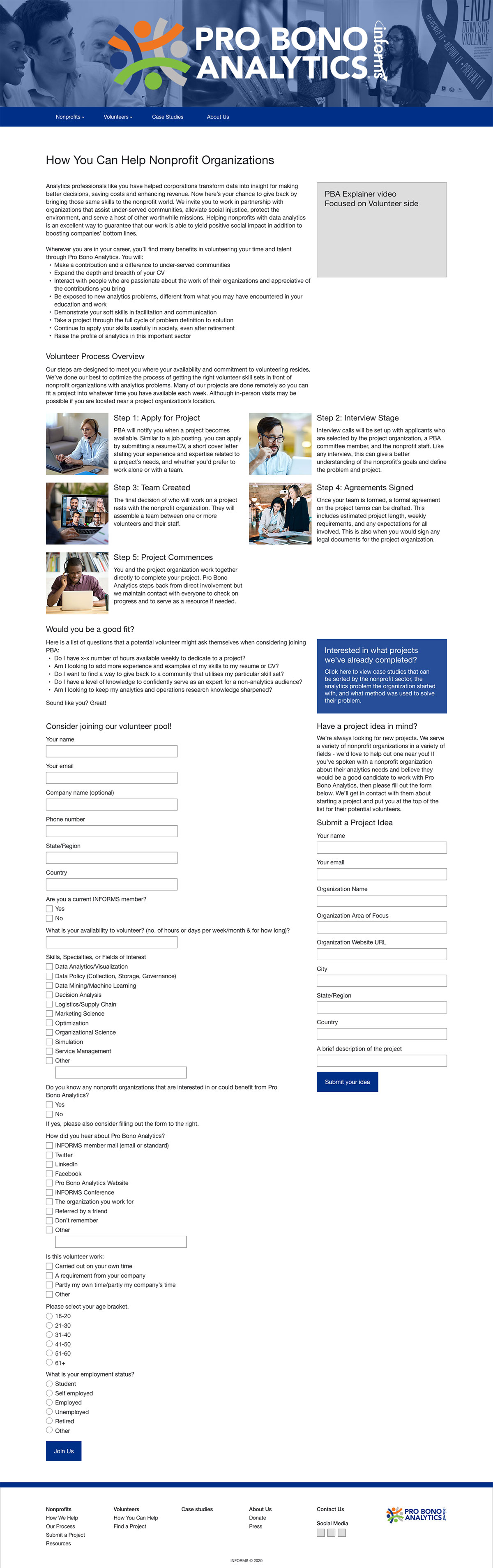
Considering the two viewpoints users would potentially be entering the sites from and the redesign goal of increasing project submissions, I focused the target audience on Nonprofit Organizations and created a secondary audience of Volunteers, both potential and current. Due to the size of these potential groups demographically, I focused instead on developing both of these audiences with psychographic data and noted their levels of experience with the concepts of analytics and operations research as this would affect the complexity of the language on particular pages.
Information Architecture
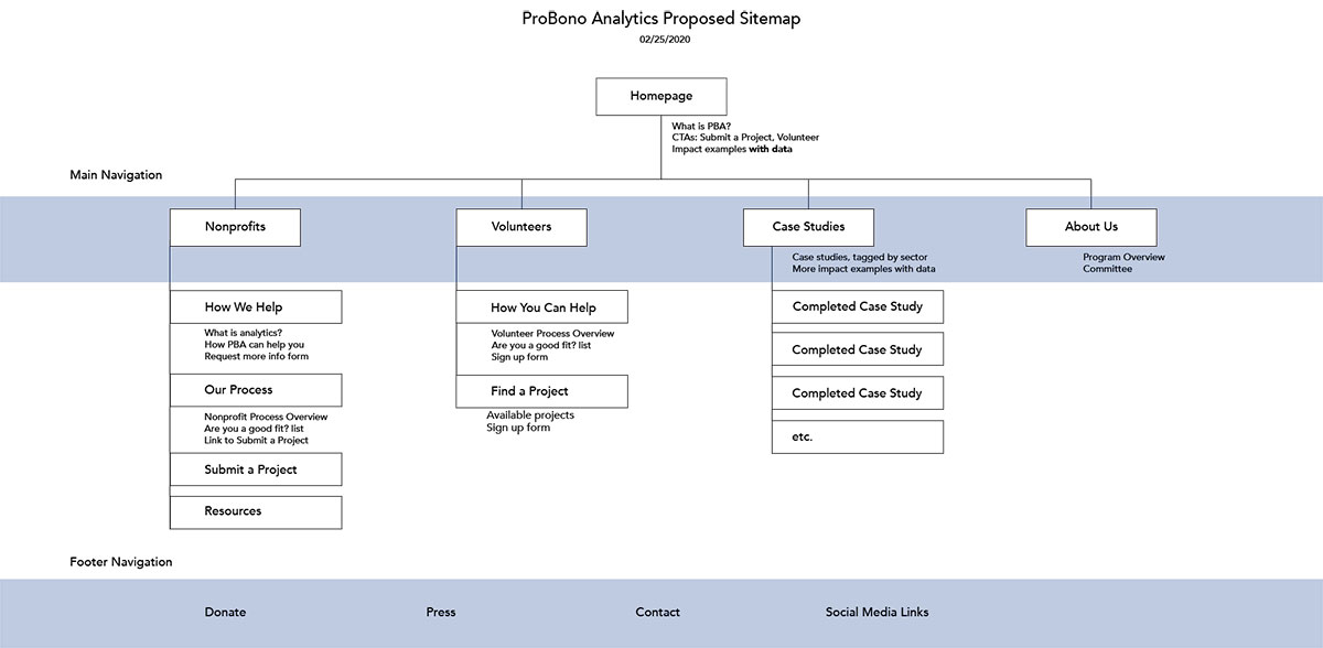
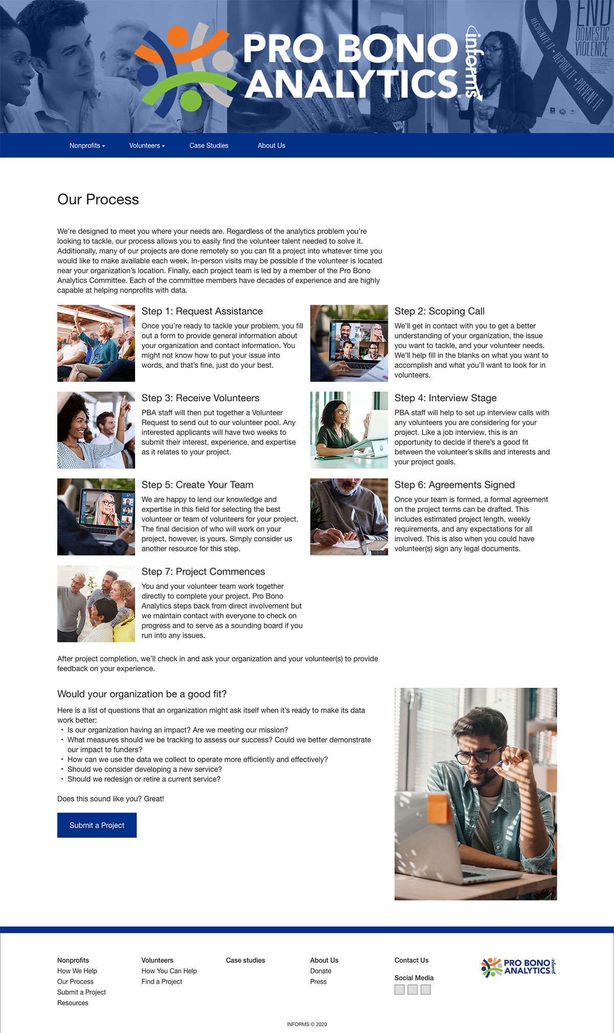
I drafted a new sitemap with my research findings and audience information in mind. First, I created two areas for each audience in order to center their narratives and needs as the previous site did not walk users through a process and this needed to be addressed. For these, I tried to keep the Buyer’s Journey in mind while structuring where content would live because, despite there not being a concrete buy involved, we would still be asking someone to enter into a process and a potential time commitment of at least 3-6 months for a project. It would be important to make them feel understood and invested in the process as they entered the workflow.
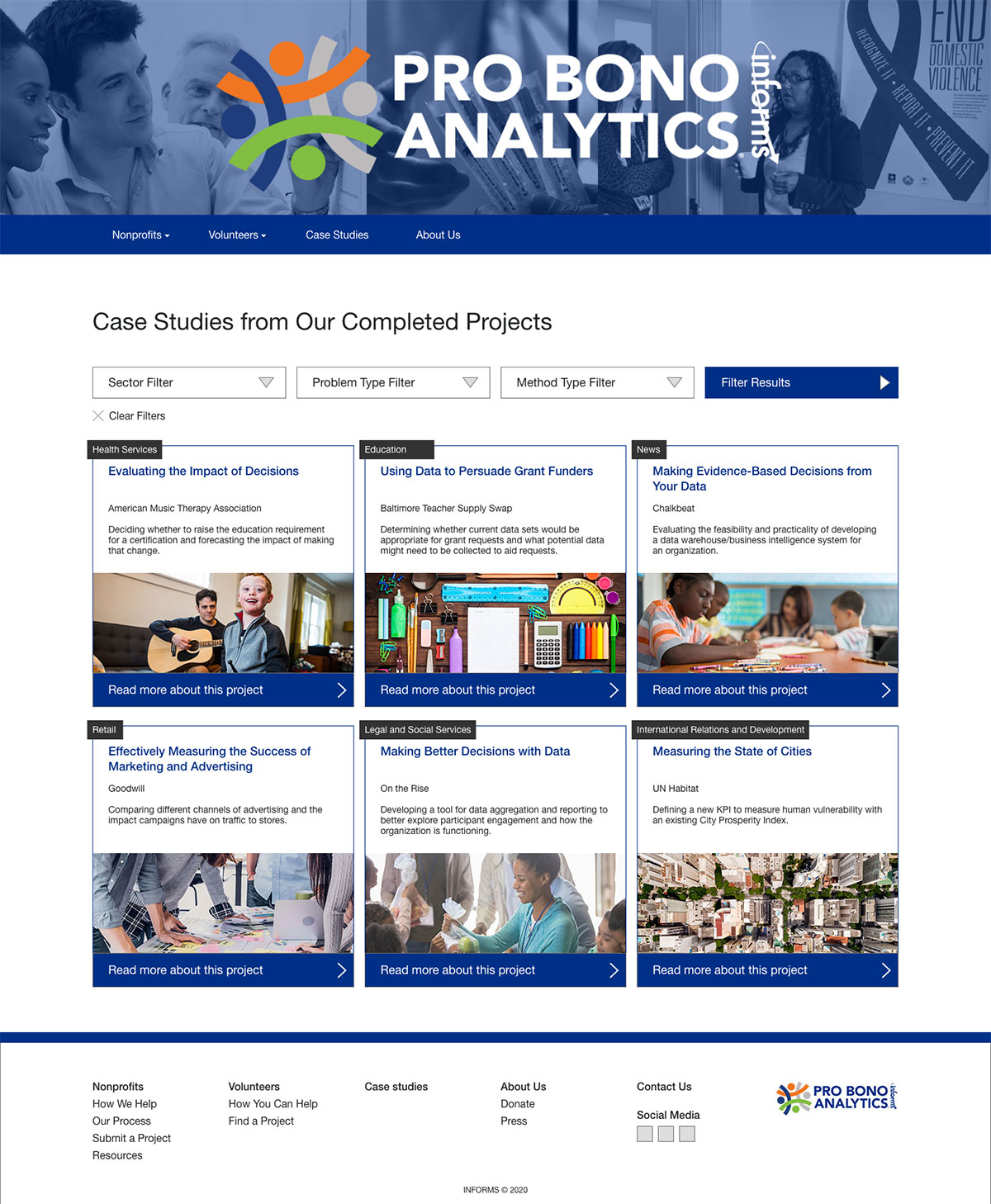
The next critical area would be for case studies. This is where PBA would be able to highlight their results and be a key component for giving PBA credibility as an organization that produces results for both audiences. This was also one of the committee’s biggest initial hopes for the new website. Previously, they had simply been listing organizations with the project’s problem statement. For the new page, I suggested implementing a searchable system with filterable tags that could help a user find the kind of case study they would find most useful.
Finally, I created a footer navigation section. Previously, all menu items had been placed within the main navigation bar which resulted in a somewhat structured list that it was difficult to know where to click. Creating a new section allowed the main navigation to become focused on answering user needs while still keeping secondary and tertiary pages, like press mentions and donations, available. These pages were some of the least visited and the committee liked to have them but weren’t actively driving traffic to them.
Content Creation
As soon as the new sitemap was approved, I created a spreadsheet to track progress on the development of the text and video content as well as the sourcing of images. From there, I began to draft documents of all the pages for the website and added what content had been previously available to them as a starting place.
I used the software SEMRush to research and analyze what SEO keywords were currently being leveraged by the comparative sites I had used earlier in the process. This allowed me to develop and test a framework set of phrases to build the PBA SEO strategy around. A Marketing team member then used this framework and SEMRush to re-write and edit all of the new text content for better search engine results with the goal of more pageviews for the new website.
While that team member was re-writing the text content, I worked with our Communications Manager and Marketing Director to develop scripts for three animated explainer videos of around one minute in length each. One video was a broad context explanation of what PBA was and did, the other two videos each took the perspective of one of our audiences and described what PBA could do for them. Once the scripts were recorded, I used a program called Toonly to create all three videos.
Mockups
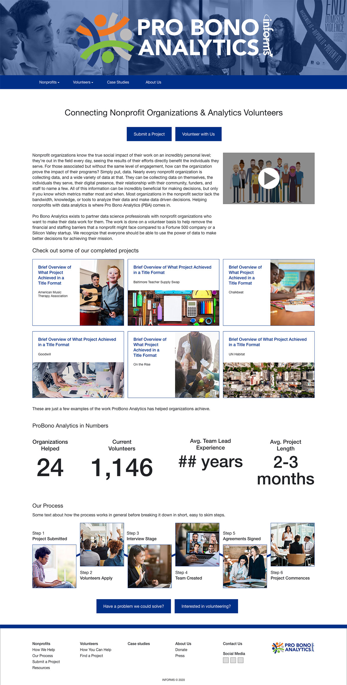
Concurrently to content being created, I began low-fidelity mockups of all the new webpages. I chose to skip the wireframing stage for this project as none of the website’s functionalities were changing with the exception of dropdown filters being added to the case studies page. The low-fidelity mockups were then tested internally with a few team members not involved with PBA to ensure clarity and ease of navigation.
Knowing the previous PBA website had been built on the HigherLogic platform and lack of project budget meant it would remain there, I made sure all of my designs would be accomplishable within the HigherLogic system. This meant accounting for preset page, row, and column layouts, as well as limited customization input points.
As content was developed and made available, I converted the mockups into high-fidelity versions which were then produced as a working prototype. This prototype was reviewed and tested by the PBA committee and the Marketing Director for approval.
Implementation
Building within the HigherLogic platform, I rewrote the PBA custom CSS to fit the approved design. I also added more extensive responsive layout scaling than the HigherLogic system allowed. All implementation work and testing occurred within a period of about two weeks leading up to the scheduled soft launch.
The soft launch allowed for the discovery of a few minor issues which I quickly addressed. No major issues were discovered, and feedback was positive. Of note, the soft launch did not include the filtering on the case studies page as only six were completed at that time. I explained to the committee that I would be happy to include it once they had completed at least ten case studies, but with fewer than that, sorting wasn’t needed to help focus a user’s perusal of the case studies.
Unfortunately, an official go-live never occurred due to an outside circumstance taking precedence over our employer’s communication channels.
Outcomes & Results
This was a project I came into passionate about and came out on the other end even more so. I appreciated the opportunity to help reach out to nonprofits about ways to improve their own work and reporting. Additionally, the client was thrilled with their new website and commented many times how much they appreciated the time and effort I had put into my suggestions and designs. As a group of analytical scientists, they tend to easily focus on the details of something rather than the big picture, so I did my best to craft my presentations to continually remind them of the goals of the project and how the details went into reaching those goals.
Initially, the client had asked for a complete overhaul of their website, but my research and findings showed that what they actually needed was a content restructure and focus on their audiences. This led to a significant savings in time and effort without having to develop a new look for the website. Once the correct messaging and storytelling were created, it was simply a matter of leading the user through their appropriate journey into the content.
As of three months out from the soft launch of the website, organic search acquisition is up 64% and overall pageviews are up 107%. Additionally, volunteer applications for project calls are up 250% and they have received two new project submissions from nonprofit organizations.