
Role and Responsibilities
- UX Research: industry comparisons, wireframing testing
- Sole Designer: wireframes, mockups
- Front End Development: All CSS and at least 80% of HTML (worked with backend system developer)
Scopes & Constraints
- No budget
- Developed within existing CMS (ezPublish)
- Looked to add much more categorization, searchability, and SEO
Timeframe
May-December 2022
Product/Client
The PR & Public Advocacy department of the professional association was looking to revamp their News Room website section from just listing press releases and links to having improved searchability, navigation, and user experience for both members and external news media personnel.
Problem
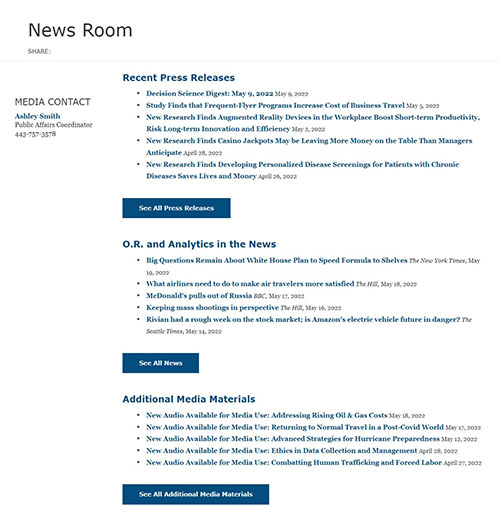
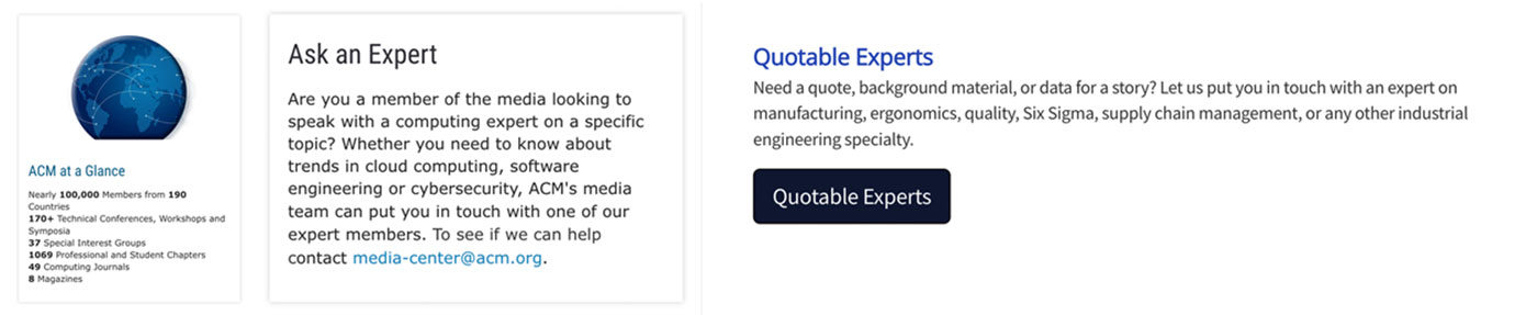
The previous News Room was a subsection of the main website that showed two lists of links: one to press releases and one to outside articles that quoted the association's members. The client had no way to highlight information other than recency of publishing. They wanted to be able to highlight releases and articles based on what was topical in the wider news media as well as adding better ways to search all of the section’s content. Additionally, they needed a way to be able to highlight various members as potential sources for news media personnel to get in contact with for quoting and opinion pieces.
What Happened
The client approached me to work on this redesign with some research completed. They had a mockup of the new look and some functionality they wanted for the main page but this left a lot of questions for how the rest of the section would work and how all of it could be navigated more efficiently. I began by looking at competitor news sections for navigation setups and functionality, then followed that up with looking again at the comparison sites the client had used for their mockup.
Another step I took from the onset of this project was to loop in the client backend developer on what the client goals were. I worked closely with him the entire process to make sure the end result was achievable within their current CMS as this was a necessary requirement for the project.
Wireframe Testing Discovered Language/Wording Problem
From there, I drafted wireframes for the new section pages with a focus on navigation and adding in categories of content. I then tested these wireframes for their usability with two testers and quickly determined a few key changes to make. First, while the use of categories and listing on content was helpful to the overall goal, the language used on the pages was confusing and, ultimately, relied heavily on client-based terminology, not industry terms. Second, that there needed to be a way to quickly get the user in contact with the client media contact when the user had a request.

With this in mind, I was able to quickly iterate on the wireframe design and perform some research on what language should be used that would be closer to news industry standards. Once these changes were made and approved by the client, the wireframe test was repeated and proved much more successful.
Improving Navigation with Improved Information Architecture
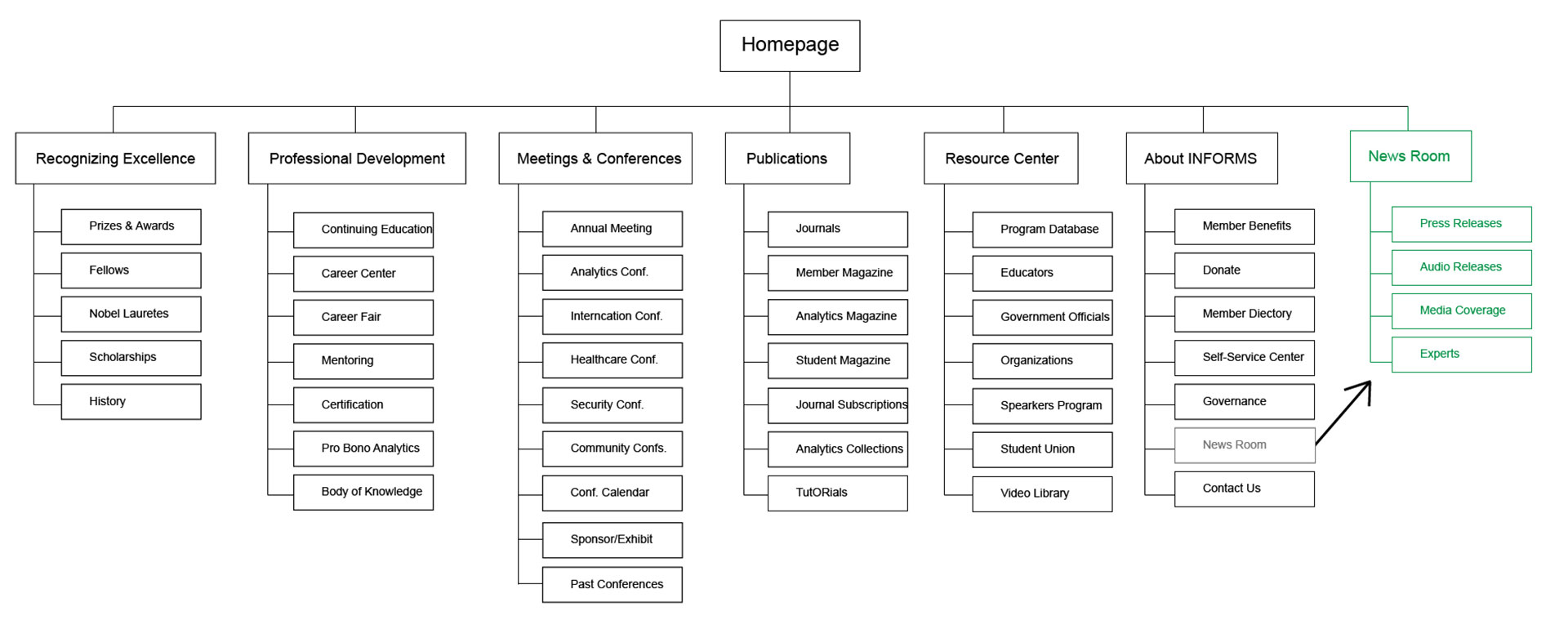
I then created mockups of the new News Room section and presented these to the client stakeholder and the backend developer, again ensuring that the design would be doable. I also recommended pulling the subsection out of its current location in the main website under the About section and making it into its own section by itself within the website information architecture. Within the CMS they were using, this provided better navigation options within and around the news section than had existed previously when it was essentially a few listing pages, all while not affecting the rest of the website’s IA. This would also allow for better and more robust SEO options to the newly resulting pages within the news section.
During development, I worked closely with the backend developer to create the new page templates needed for the new designs. This involved creating and editing a number of new templates to be able to display multiple articles at a time based on category and tag criteria across four different types of written content: press releases, audio releases, media highlights, and member contacts. I was also responsible for writing all the CSS for the project.
In the lead up to launch, I worked closely with the client to bring past content up-to-date but adding categories, tags, and moving content from its previous location in the website information architecture to its new location. I also added updated SEO content to all new main pages of the section and performed all browser testing.
Outcomes & Lessons Learned
Test, test, test
Wireframe testing discovered some key usability issues early on with the language being used for section titles and content names. Being able to take a little extra time and research better alternatives at the wireframing stage helped save a lot more time later in the development pipeline. Additionally, having the wireframe testing to refer to when being asked about future design changes helped to head off additional design iterations later in the process.
Best Practices vs. Stakeholder Opinion
While it is my job to search out the user’s needs and advocate for them, there will always be some friction between that and what a stakeholder desires. Learning into this friction and being comfortable with it helped me to better find common ground with the primary client stakeholder. When I dug into why they felt so strongly about moving a button higher on a page, it led to a deeper conversation about the root concerns of the stakeholder which I was then able to address. Overall, this leads to a better product that better combines the needs of the user and the needs of the business.